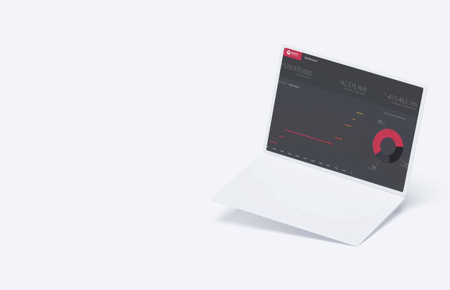
Mente Group came to us wanting a design for their web app that would present and manage their proprietary private plane financial data for portfolio managers. We worked through the complex data points and technological constraints to make an efficient and beautiful interface that worked as well on giving overviews as well as the nitty gritty.
We found ourselves working in a bubble on a product that had not yet been launched, with no existing users to guide our decisions. Our aim was to empower decision-makers with the ability to make informed choices, whether focusing on the broader scope or finer details. This necessitated the creation of an interface design centered around clarity and content.
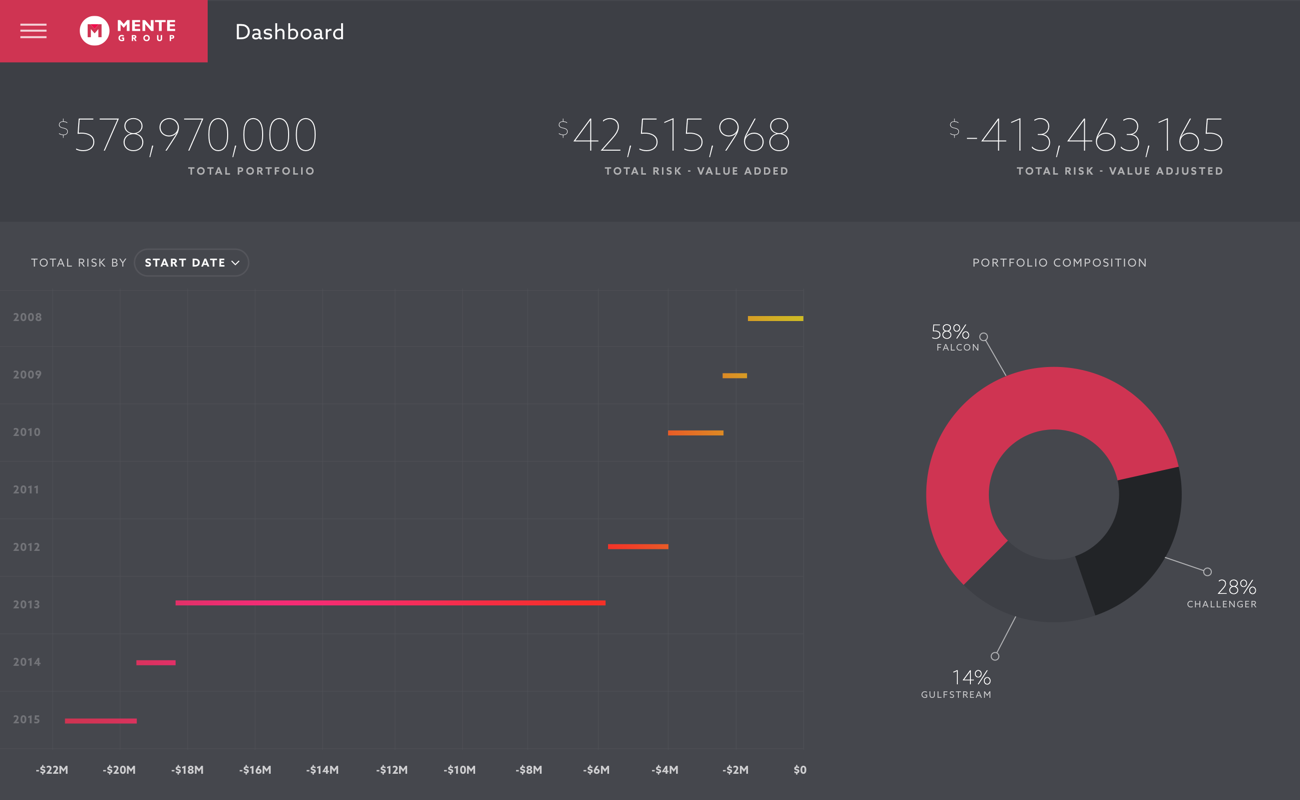
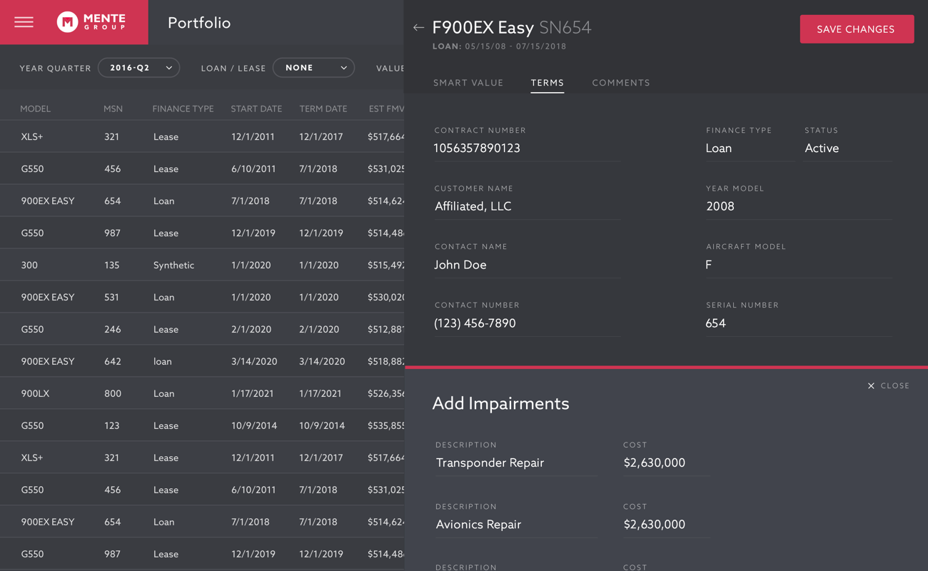
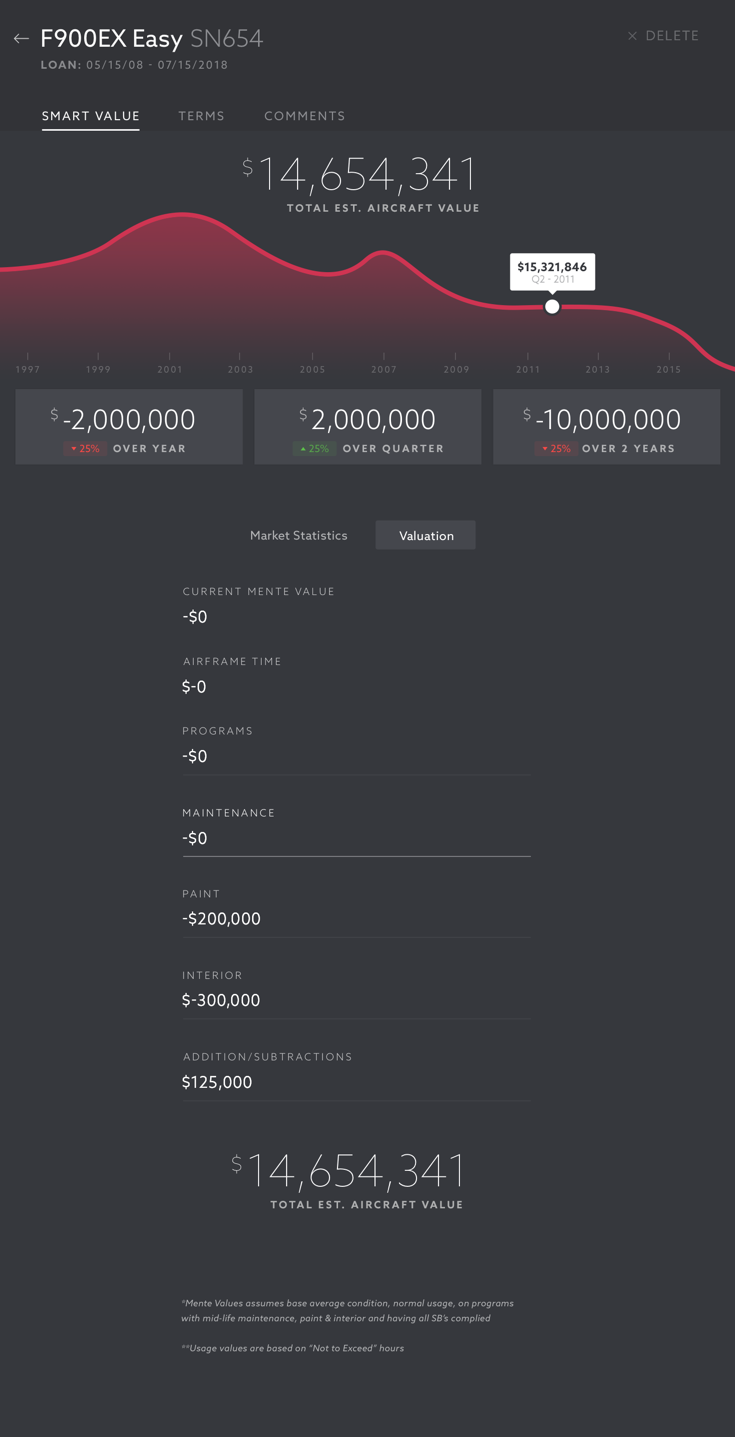
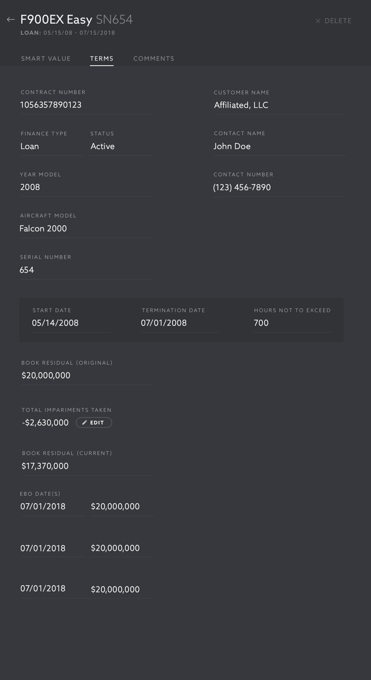
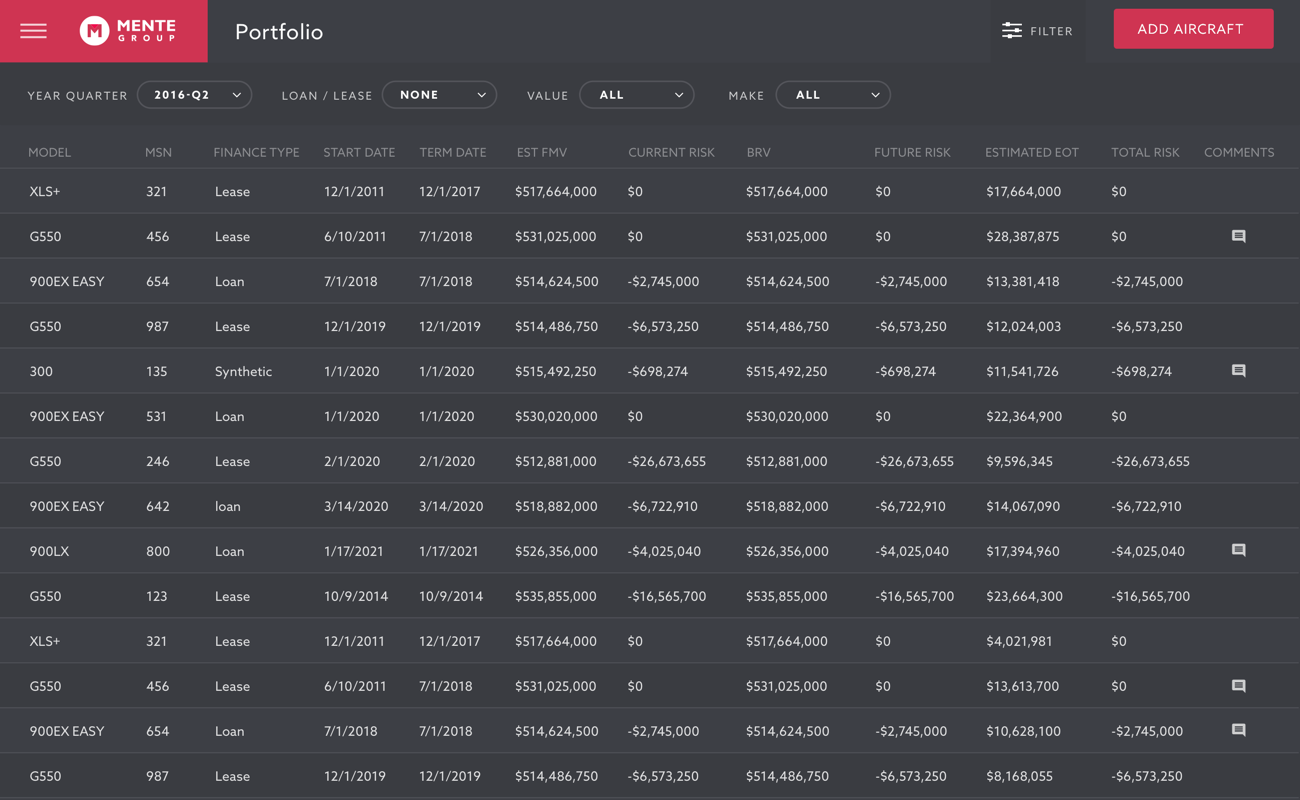
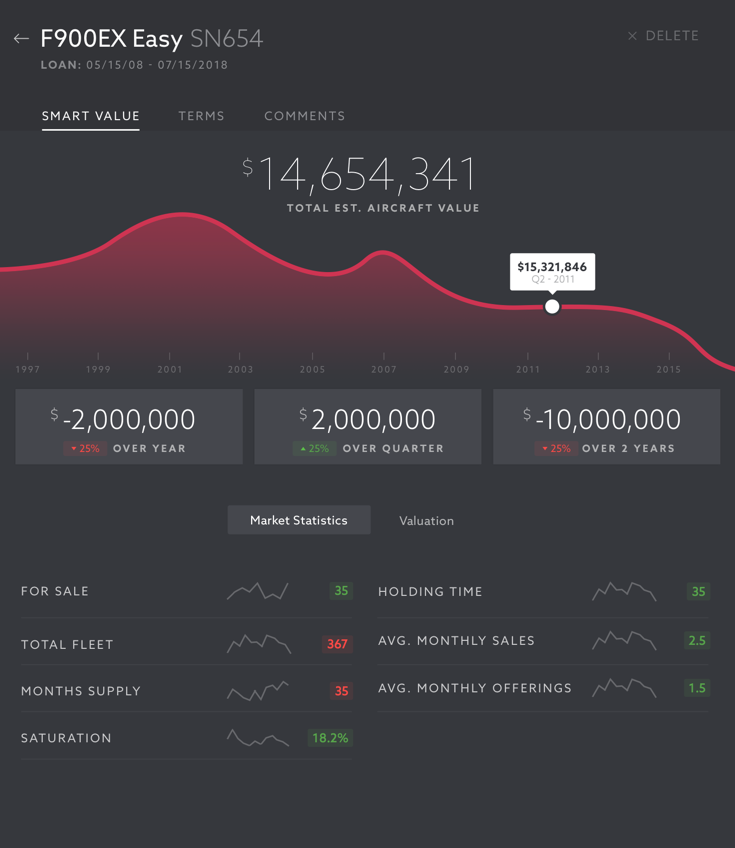
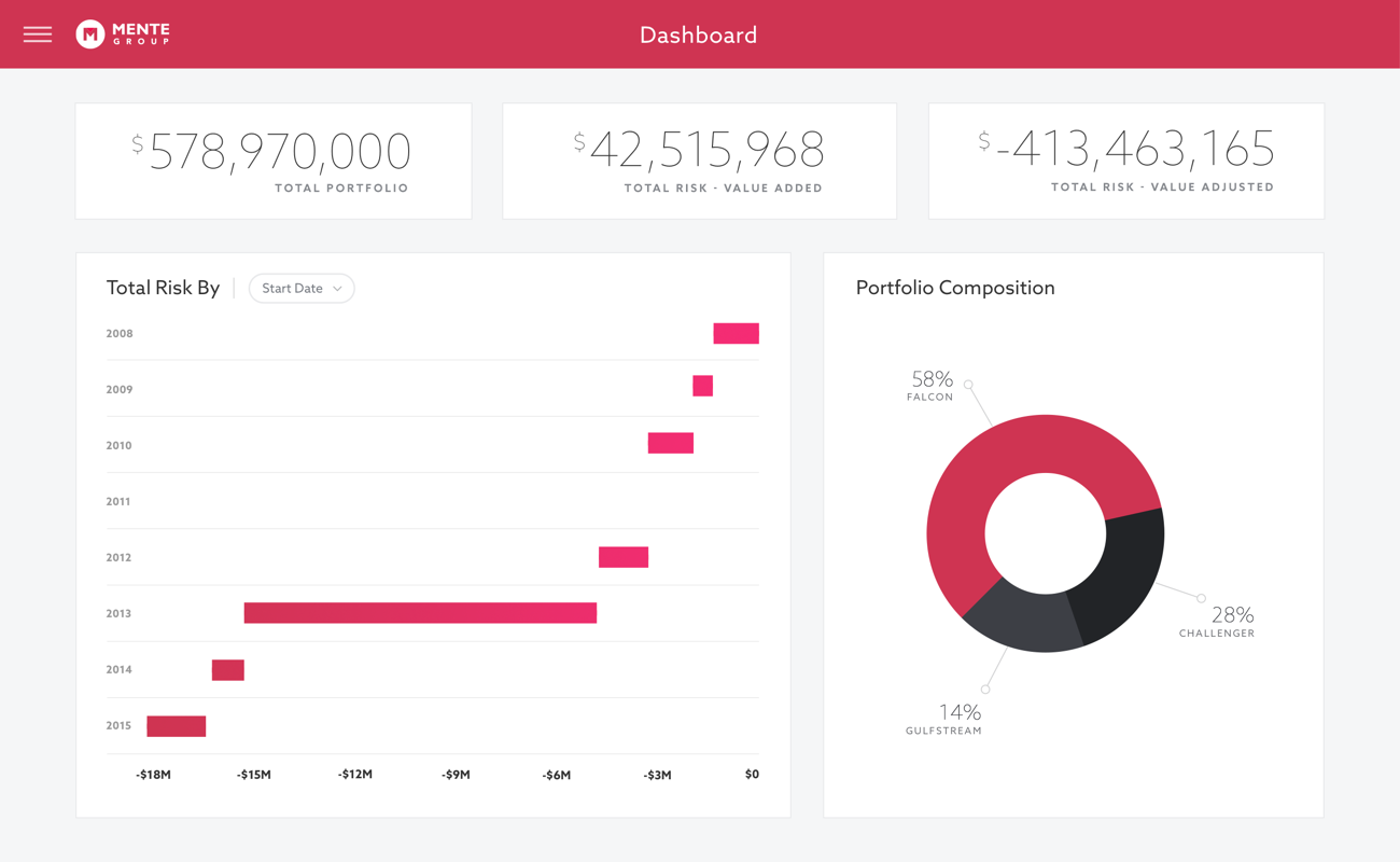
Boiling down hundreds of data points into an easily scannable form we distilled each piece of information to its simplest form. Spark lines, color indicators, and a minimalist UI kept complicated screens as functional as possible.
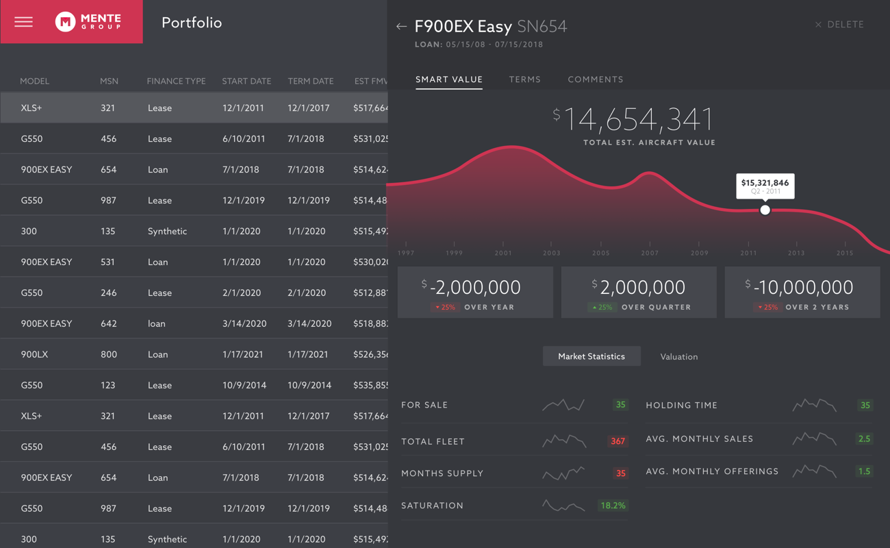
In an effort to combat “pogo-sticking” between the list and detail view we implemented a sliding pane system. Comparison and contrast of detail views could be handled with ease. The same technique was utilized for global navigation to keep the UI as simple and clean as possible.
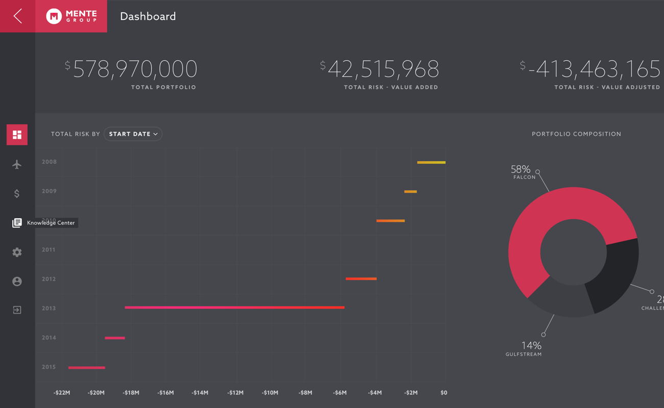
While major layout and strategy systems had been explored, the question of light or dark color scheme had come up. Dark giving users relief from eye strain, and white being a more safe option. We A/B tested these options with prospective customers and came to the conclustion dark was preferred.
The application was rounded out using an efficient design system of reusable components. We kept view and edit states efficient with a simple edit in place strategy. Typography and color changes were minimized between form, tabulature, and charting views.